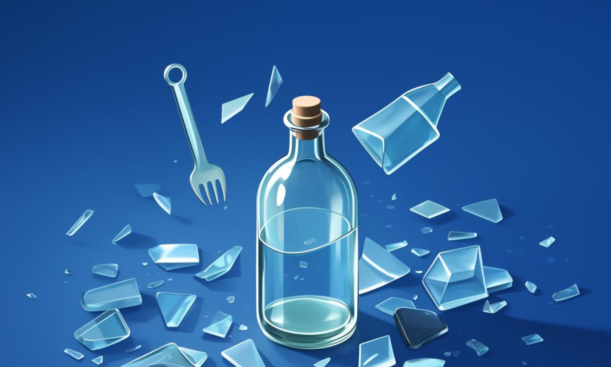
When it comes to glass packaging, the color you choose can significantly impact your product’s appeal, brand identity, and marketability. Whether you’re launching a new product or updating your existing packaging, selecting the right color is a crucial decision. In this guide, we’ll walk you through how to choose the perfect color for your glass packaging, ensuring it aligns with your brand, appeals to your target audience, and enhances your overall marketing strategy.
### Factors to Consider When Choosing Glass Packaging Colors
Choosing the right color for your glass packaging isn’t just about aesthetics—it’s about creating a cohesive brand experience. Here are the key factors to consider:
1. **Brand Consistency**
Your packaging color should align with your brand identity. If your brand is known for its sleek, minimalist designs, a neutral color like clear glass or soft pastel hues might be the best fit. On the other hand, if your brand exudes energy and vibrancy, bold colors like bright red or electric blue could work well.
2. **Product Features**
The color of your glass packaging also depends on the nature of your product. For example:
– **Food and Beverage**: Clear glass is often preferred for transparency, while opaque colors like green or brown are great for dark beverages.
– **Pharmaceuticals and Cosmetics**: Neutral tones like black, white, or metallic finishes are commonly used to convey trust and sophistication.
– **Household Products**: Soft, muted colors may better suit everyday items, while vibrant colors can make cleaning products or personal care items stand out.
3. **Consumer Preferences**
Research your target audience to understand which colors resonate with them. For instance, pastel colors like lavender or coral are often preferred by younger audiences, while classic colors like black or silver appeal to a broader demographic.
4. **Environmental Considerations**
Sustainability is a growing concern for consumers. Some colors, like green or blue, may signal eco-friendly packaging, which can be a significant selling point.
### Tips for Choosing the Right Glass Packaging Color
Now that you understand the key factors, here are some tips to help you make the best choice:
1. **Use Test Strips**
If you’re unsure about a color’s appeal, consider using test strips or small samples. You can display these on your shelf to get a better sense of how the color looks in different lighting conditions.
2. **Consider Seasonality**
Colors can also be seasonal. For example, pastel colors may be more popular in spring, while richer, deeper tones are better suited for winter.
3. **Think About Long-Term Visibility**
Some colors may fade or look different under certain lighting, especially in direct sunlight. Opt for colors that maintain their vibrancy over time.
4. **Use the Right Tools**
If you’re unsure about color combinations, tools like color wheels or online color palettes can help you explore complementary and analogous colors.
### Suggested Colors for Glass Packaging
Based on the factors above, here are some color suggestions for your glass packaging:
1. **Clear Glass**
– Ideal for products that benefit from transparency.
– Works well for organic, natural, or artisanal brands.
2. **White/Off-White**
– Conveys purity, cleanliness, and sophistication.
– Great for pharmaceuticals, skincare, and luxury products.
3. **Black**
– Symbolizes elegance, professionalism, and exclusivity.
– Perfect for high-end products like fine wines or luxury goods.
4. **Gray**
– Offers a modern, understated look.
– Works well for tech products, home goods, and industrial applications.
5. **Gold/Silver**
– Adds a touch of luxury and sophistication.
– Ideal for premium products like spirits, cosmetics, or high-end fashion.
6. **Pastel Colors**
– Soft, calming shades like lavender, coral, or peach.
– Great for targeting younger audiences or products with a friendly, approachable image.
7. **Bold, Vibrant Colors**
– Colors like neon red, electric blue, or fluorescent yellow.
– Best suited for eye-catching products, such as candies, snacks, or party supplies.
### Avoid Common Mistakes
When choosing your glass packaging color, avoid the following common pitfalls:
– **Overcomplicating the Color Palette**
Too many contrasting colors can make your packaging look unprofessional and hard to read.
– **Choosing Colors That Don’t Reflect Your Brand**
Stick to colors that align with your brand’s identity to maintain consistency.
– **Ignoring Lighting and Environment**
Test your chosen colors in different lighting conditions to ensure they look good in all settings.
### Conclusion
Choosing the right color for your glass packaging is a strategic decision that can greatly impact your brand’s success. By considering brand consistency, product features, consumer preferences, and environmental considerations, you can select a color that resonates with your audience and enhances your marketing efforts. Remember to test your chosen colors, explore complementary palettes, and stay aligned with your brand identity to make the best choice for your glass packaging.
If you’re still unsure, consider reaching out to a professional design team or testing your top color choices with real-world samples. The right glass packaging color can make all the difference in how your product is perceived and how effectively it sells on the shelf.
[Insert Image: https://starglassbottle.com/wp-content/uploads/2025/03/6535-Apothecary-Glass-Bottle-X2__87574.jpg]